Popular brands that recently changed their logo design
‘Does a brand logo even matter?’, you ask.
And ‘dear god, yes!’ we say. What lies behind a successful logo isn’t just its aesthetic attractiveness. Studies suggest that consumers tend to evaluate a brand or a product simply based on its logo.
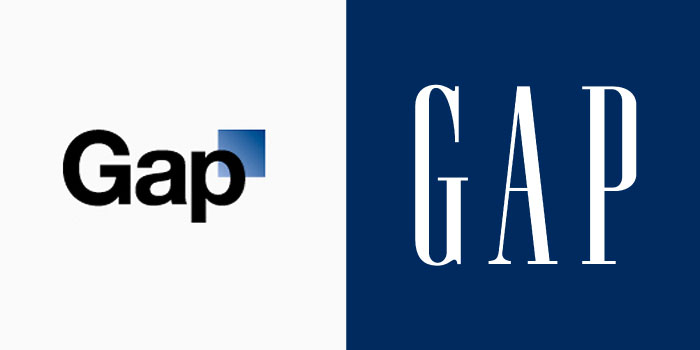
And it is not as if consumers haven’t strongly reacted to a brand logo change. Remember back when Gap changed their logo to something lacking soul? If not, look below; the 2010 redesign on the left received much flak and had to transition back to the original on the right:
(Source)
If it’s a somewhat tricky business, why do brands choose to change their logos?
A common reason to redesign a logo is to modernise it by bringing it up to the current standards, digitally and otherwise. An apt example of this is the ever-evolving Google logo which has changed from its 3D-look with drop shadows of the past to the current version with simple, flat, and modern-looking text.
![]()
(Source)
Companies also choose to go in for a new logo when experiencing an expansion of a product line, or when undergoing an acquisition or merger. A new logo helps these brands ensure that they aren’t associated with just one type of product (as in the case of Starbucks and Domino’s) and helps avoid confusion amongst their customers.
A few brands even change their logos (sometimes temporarily) to celebrate milestones.
Whatever the reason, it is critical to ensure that the transition isn’t a slapdash job. And we believe that the best way to learn is from a few recent instances. Take a look:
1. Britannia
Most of us have grown up eating Britannia biscuits. So believe it or not, this food company celebrated its centennial anniversary last year. And on this occasion, Britannia launched their new logo:
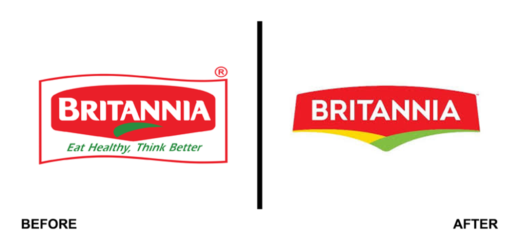
(Source)
The aim was for the new logo to reflect “accessibility, well-being and excitement”. The redesign was also accompanied by a campaign titled ‘Sau Saal Jiyega’ that thanked the brand’s customers.
2. American Express
American Express, or Amex, unveiled their new logo in April 2018. You didn’t notice it? Don’t worry; it is because that’s how the brand wanted it to be.
The change they’ve made is in the colour scheme, and it is very subtle.
![]()
(Source)
The brand decided to update their logo – first time since 1975 – to adapt to the digital world. The new logo is much clearer, and a cropped version of it was also launched, keeping in mind smaller screens.
(Source)
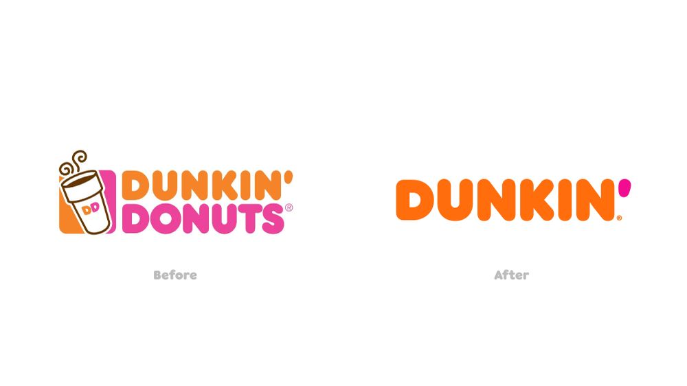
3. Dunkin’
Dunkin’ Donuts rebranded in September 2018 and is now called Dunkin’. This change came after the brand decided to expand its product line and broaden focus to include beverages.
(Source)
This change has gotten mixed reactions from customers. Some thought that the brand should have always been called Dunkin’ while many others said that the company wouldn’t feel the same without Donuts in the name.
4. Uber
Just two years after the last logo was launched, Uber announced a rebranding in September 2018. The new logo has the brand’s name clearly visible with a capitalised U and the rest of the name in lowercase.
![]()
(Source)
The logo on the left was abandoned since both consumers and drivers weren’t connecting with it (“ Uber says it even found that some drivers turned the company-supplied decal inside out, since the name was on the flip side”).
With the new logo, Uber aims to ensure a seamless association with the brand.
5. Zara
Earlier this year Zara, the fashion retailer brand unveiled its new logo. The change led to the creation of a taller and closer textual representation of the brand name.
![]()
(Source)
Since inception, this is only the second time that the brand has changed its logo. However, the change was not very well received by the brand’s customer base.
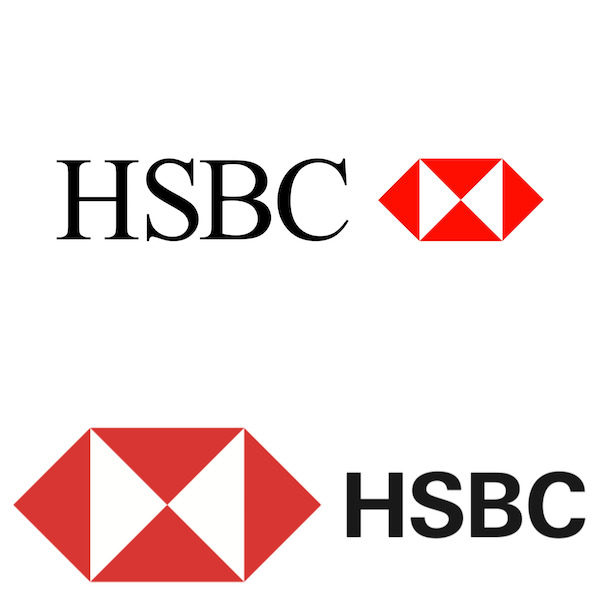
6. HSBC
In April last year, HSBC – one of the largest banks in the world – launched their new logo. It placed more importance on the red hexagon.
(Source)
The rebranding was done primarily to associate the brand with digital trends. The text was created with the font Sans Serif, and it was placed to the right of the hexagon.
The bank launched a campaign ‘Together, we thrive’ in conjunction with their brand logo to reflect its message of being committed to helping its customers flourish.
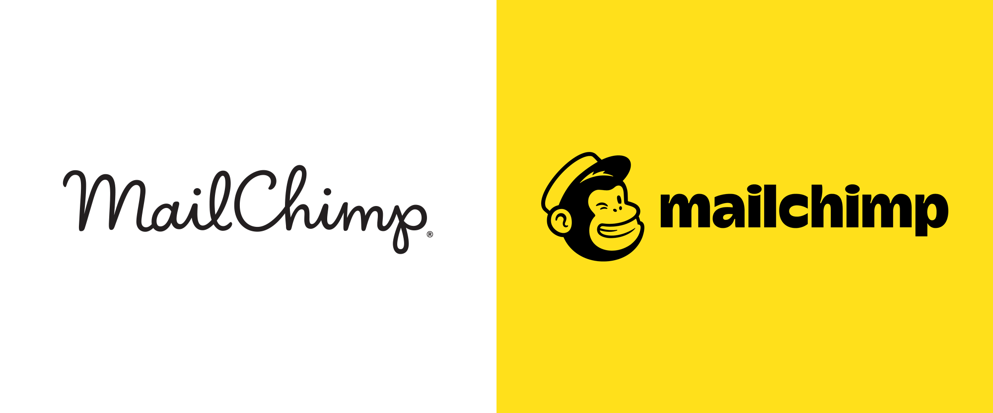
7. Mailchimp
Mailchimp, a leading marketing platform, rebranded in September last year. The brand revamped its logo, typeface, platform, colours and much more.
(Source)
With this big step, the company sought to unify all its offerings, even as these creative changes retained an inherent linkage with its roots.
A particularly noticeable change saw the uppercase ‘C’ in their brand name convert to a lowercase ‘c’.
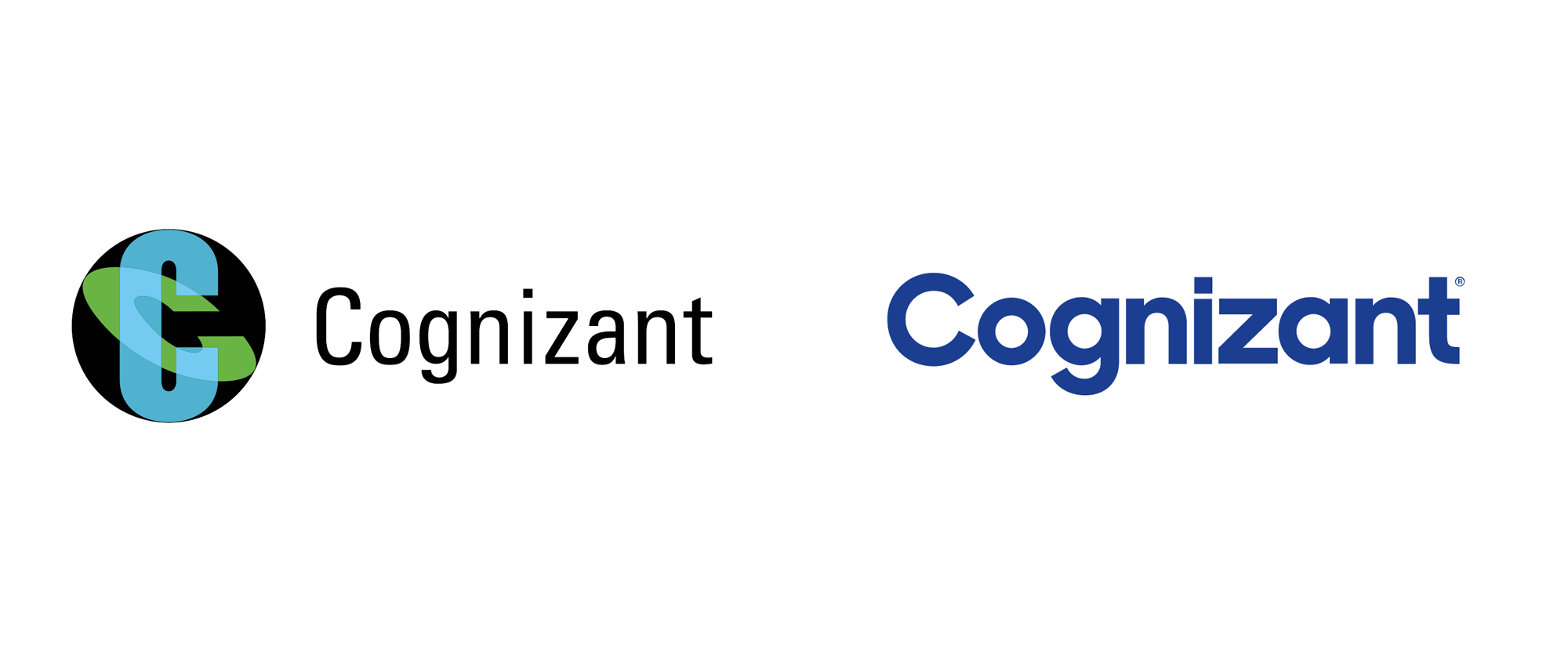
8. Cognizant
MNCs too are adapting to the digital transformation happening throughout the world. A few months back, Cognizant launched its new logo.
(Source)
The core thought driving this transformed identity was the brand’s work and motto: digitally transformative, thereby, ensuring that their clients remain ahead of, or at par with their competition.
The brand also wanted to highlight the word ‘Cognizant’ to let their customers know that they aimed at staying true to the meaning of this word.
9. Comscore
In October last year, Comscore launched its new brand logo.

(Source)
Similar to the previous one, the overlap between two screens (blue and orange) continues to be the central idea of this logo, thereby ensuring continuity.
In addition to filling these screens with colour, Comscore now has an additional red screen in the spotlight which is dedicated to consumers.
The change aims to reinforce the centrality of the consumer to the brand through high-quality service and insights.
To make things easier on the digital front, the brand has also removed the capitalised ‘S’ from its brand name and introduced a simpler font.
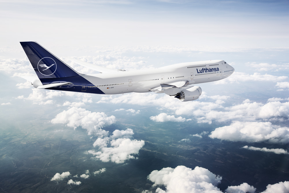
10. Lufthansa
Like Britannia, Lufthansa too celebrated their centennial anniversary in February last year. And on this occasion, they revealed their new brand logo.
(Source)
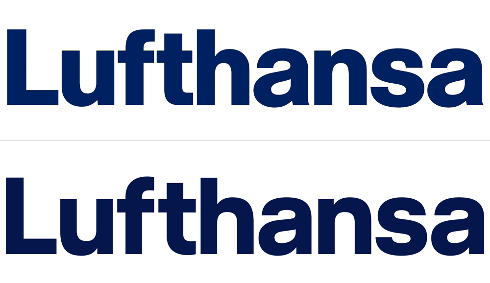
It retained elements like the crane and the ring surrounding it. The change was primarily reflected in the colours of the logo. They went from blue and yellow to just blue – the colour of the crane on a white background. A darker shade of blue became the lead colour.
The brand also developed a new typeface, keeping in mind the needs of the digital world.
(Source)
Final thoughts
Changing a logo is a big decision for any brand. It ensures brand recall and its association with the experience that is on offer.
As most experiences quoted here suggest, rebranding must remain an ideal interplay between retaining the spirit and roots that the brand inherits, even as it evolves with the time and space it represents.
The success of this endeavour is a long-term process. It manifests in both consumer consciousness and subconscious over time. And if this branding is a successful exercise, it can perceptibly enhance its residual impact.
Also read: First impressions: What design does for content marketing